Writing Guide
Contents
For Writing
Write in Active Voice
Writing in the active voice allows you to use fewer words and leave less room for ambiguity.
When to use passive voice?
- When the active subject is the user and there is an error to troubleshoot (using the passive voice here can sound like you’re blaming the user)
- Example: “If there is an error you probably omitted a step” versus “If there is an error a step may have been omitted”
- When the active subject is unknown or when you want to emphasize the object.
- Example: “The UI provides a message” versus “A message is provided by the UI”
- When the active voice is wordy or awkward
- Example: “In 2007 engineers developed a software suite to simplify the installation” versus “A software suite that simplifies installation was developed in 2007”
Avoid Ambiguous Titles
Each title should be clear enough for the reader to know what the article will be about.
- Ambiguous title: Example: “Installation Guide”
- Clear title: Example: “How to install Eyeglass VM on Windows”
Describe the Most Common Use Case First
Use cases should be presented in order of priority with the most common cases presented first and additional cases presented with “if” or “however”.
Avoid Prepositions at the End of Sentences
To fix this issue you may replace the compound verb with an active verb with the same meaning.
- Example: "This is the solution you are looking for" should be "This is the solution you seek".
Avoid Personification of the Documentation
Words like “hopefully” and “basically” should be avoided as well as all adverbs that provide the documentation with “feelings”.
Avoid Needless Politeness
Don’t use “please” or “thank you” or any variation of these.
Use Consistent Terminology
If a certain feature or service is named a certain way in the documentation, continue to use this same terminology with the same characteristics.
- Example: If something is referred to as “To-Do” do not later call it “to do” or “to-do” or “To-do”.
Use the Serial Comma (Oxford Comma)
Use a comma before the “and” or “or” conjunctions used at the end of a list.
Use the Second Person
Speak to the user as “you” whenever possible and avoid mentioning the user as a third person in the documentation.
- Example: “You may click the button to continue” versus “The user may click the button to continue”.
Headings
CAPITALIZATION
Capitalize every word in a title that is not an article.
- Articles are: the, an, a
Format
- Do not end the title with a period or a colon.
- If there are two back-to-back headings, include some introductory text between them.
Figures and Tables
- Add a short descriptive title to the table or figure.
- Do not add the words “table”, “diagram”, or “figure” to the title.
- Do not number tables, figures, or diagrams.
- Place the title above the table/figure/diagram.
- Screenshots don’t require titles.
Lists
- When making a bulleted list with concepts that are defined inside the list, bold the concept and use a colon.
- Example: This is the way it should be.
- Use a bulleted list for options.
- Use a numbered list for steps.
- Use the same grammatical structure for all of the items in the list.
- Capitalize each item in the list.
- Only put a period at the end of each item if the item is a complete sentence.
- If a list includes both full sentences and individual words or phrases, either put a period on all or on none.
Numbers and Units of Measure
- Spell out numbers from one to nine unless it’s a measurement.
- If you start a sentence with a number, spell it out.
- In a single sentence, use spelled-out numbers or numerals, but not both.
- Use a comma as the thousands separator.
Proper Nouns
Use capitalization when you refer to a service name or anything that has a name which can be referred to directly in the documentation.
Command-line Interface Guidelines
- Format code snippets as standalone blocks.
- If the example output includes multiple lines and must be cut for simplicity, include a (...) to show that the article only displays a portion of the output.
- If you describe a CLI action in the running text or instructions:
- “You can use ping to verify the network connection…” versus “You can use the ping command to verify the network connection…”
GUI and WUI Guidelines
- Write the names of the UI elements exactly as they appear, including punctuation.
- When describing a procedure in the GUI and WUI, start the step with the location (or path) in the UI.
- Not all users will be “standing” where we need them to while following the documentation.
For Screenshots
When to insert screenshots
- When the content is confusing and the screenshot adds context.
- To show what a set of fields looks like with data in it.
- To walk a user through a task that involves various UI screens.
- When they’re relevant and useful.
When not to add screenshots
- For every step in a task.
- To provide a visual without any reference to it in the text.
- If important content is only available through an image, it isn’t accessible.
Resolution and Placement
- The size of the image captured should be proportional to the element that’s being shown.
- Center and balance the elements with the space around them.
- If you’re going to show a very small element, don’t capture a large area around it.
- A good rule of thumb is if you can clone the element to its left or right more than 3 times without leaving the canvas, the image is too big.
- The “empty” space around the shown element shouldn’t be the first thing that the eyes are drawn to.
- It shouldn’t take more than a second to find the target element.
- It’s important to note that an article shouldn’t begin with very zoomed-in images:
- Show the largest portion of the screen first to place the user in context and then start zooming in appropriately.
- Zoomed-out images are important to indicate context where necessary.
- If the description or steps aren’t clear enough with zoomed-in images, a larger area can be provided for the user.
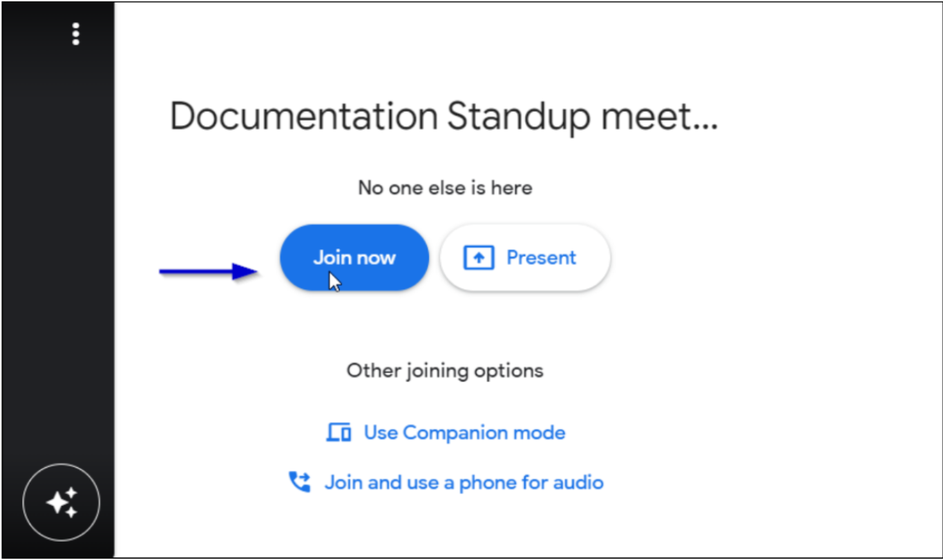
Arrows
- GreenShot offers customizable arrow thickness, length, and color.
- Official Colors:
- Blue: Wherever possible (#0000CC)
- White: Where blue isn’t possible (#FFFFFF)
- Official Thickness: 4 pixels
- Drop Shadow: Yes
- There should be a buffer of at least 40 pixels between the point of the arrow and the item that is being shown.
- The length of the arrow (including the head) must be no less than 90 pixels and no more than 150 pixels.
- Arrows must be horizontal or vertical.
- If an angle is required for any reason, it should either be 30° or 45°, but angled arrows should be avoided at all costs.
Cursor
- The cursor shouldn’t be in an image unless it’s acting like a mark or it’s relevant to the content.
- If you happen to capture the cursor with GreenShot, it allows you to remove it in the editor.
- The cursor can be used in place of an arrow if and only if it will be “large enough” relative to the dimensions of the area captured.
- If it’s too small, it may not stand out enough and it’ll be as if the image isn’t marked.
- In cases where it’s important to keep the cursor and show a large area, the image may benefit from an additional arrow or box to highlight the cursor itself.
- GreenShot allows you to move the cursor wherever you want in the image as long as you capture the cursor in the area (it should be in the area before you press PrintScreen).
- It will show the captured cursor and allow you to select it and move it.
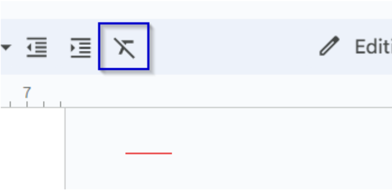
Boxes
- Official Colors:
- Blue: Wherever possible (#0000CC)
- White: Where blue isn’t possible (#FFFFFF)
- Line Thickness: 2 pixels
- Drop Shadow: Yes
- Boxes must be square or rectangular.
- They must snugly enclose the highlighted element.
- The edges of the box must not touch the element; there should be at least a 3-pixel buffer.
Blurring
- Sensitive information must be blurred in the Superna Documentation.
- Anything that can identify or reveal information about a client must be blurred.
- Image Format: Portable Network Graphic (PNG)
- Bits Per Pixel: 24
- Color: Truecolor
- Dimensions: 352 x 169
- Interlaced: Yes
- Image Format: Portable Network Graphic (PNG)
- Bits Per Pixel: 24
- Color: Truecolor
- Dimensions: 951 x 564
- Interlaced: Yes